Community
    • Login

    Notepad++ v8.9.9 Release Candidate

    Scheduled Pinned Locked Moved Announcements
    31 Posts 10 Posters 2.3k Views 4 Watching
    Loading More Posts
    • Oldest to Newest
    • Newest to Oldest
    • Most Votes
    Reply
    • Reply as topic
    Log in to reply
    This topic has been deleted. Only users with topic management privileges can see it.
    • donhoD Online
      donho @astewart77
      last edited by

      @astewart77

      Move to top still disappears.

      Please remove all plugins and test again.
      If it persists, then it could be an issue under Windows 7.

      astewart77A 1 Reply Last reply Reply Quote 0
      • astewart77A Offline
        astewart77 @donho
        last edited by

        @donho said:

        @astewart77

        Move to top still disappears.

        Please remove all plugins and test again.
        If it persists, then it could be an issue under Windows 7.

        It was a conflict with the NppMenuSearch plugin. It has a toolbar text widget that always sits at the right end of the toolbar and an option to lock the widget size. I should have noticed that the MenuSearch widget disappeared at the same time the Increment search bar disappeared. If it’s unlocked, everything works.

        Ironically, I only started posting in this thread because NppMenuSearch couldn’t find any strings/labels for the new Increment preference.

        1 Reply Last reply Reply Quote 1
        • donhoD Online
          donho @donho
          last edited by

          FYI, RC2 is available:
          https://github.com/donho/notepad-plus-plus/releases/tag/RC2

          1 Reply Last reply Reply Quote 2
          • andrecool-68A Online
            andrecool-68
            last edited by andrecool-68

            The new position of the up/down button is very inconvenient. (you constantly confuse it with the forward/backward search buttons)

            The most convenient place for it is next to the button that closes this search panel. (that’s where it belongs!)

            Снимок.PNG

            1 Reply Last reply Reply Quote 2
            • donhoD Online
              donho @PeterJones
              last edited by donho

              @PeterJones said:

              close button at most right position, up/down botton at position left next to close button

              Personally, if I used that bar, that’s what I would prefer… But they would have to adjust with window width, not be at fixed positions

              It’s quite complex to implement such idea.
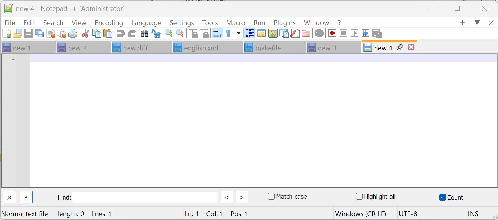
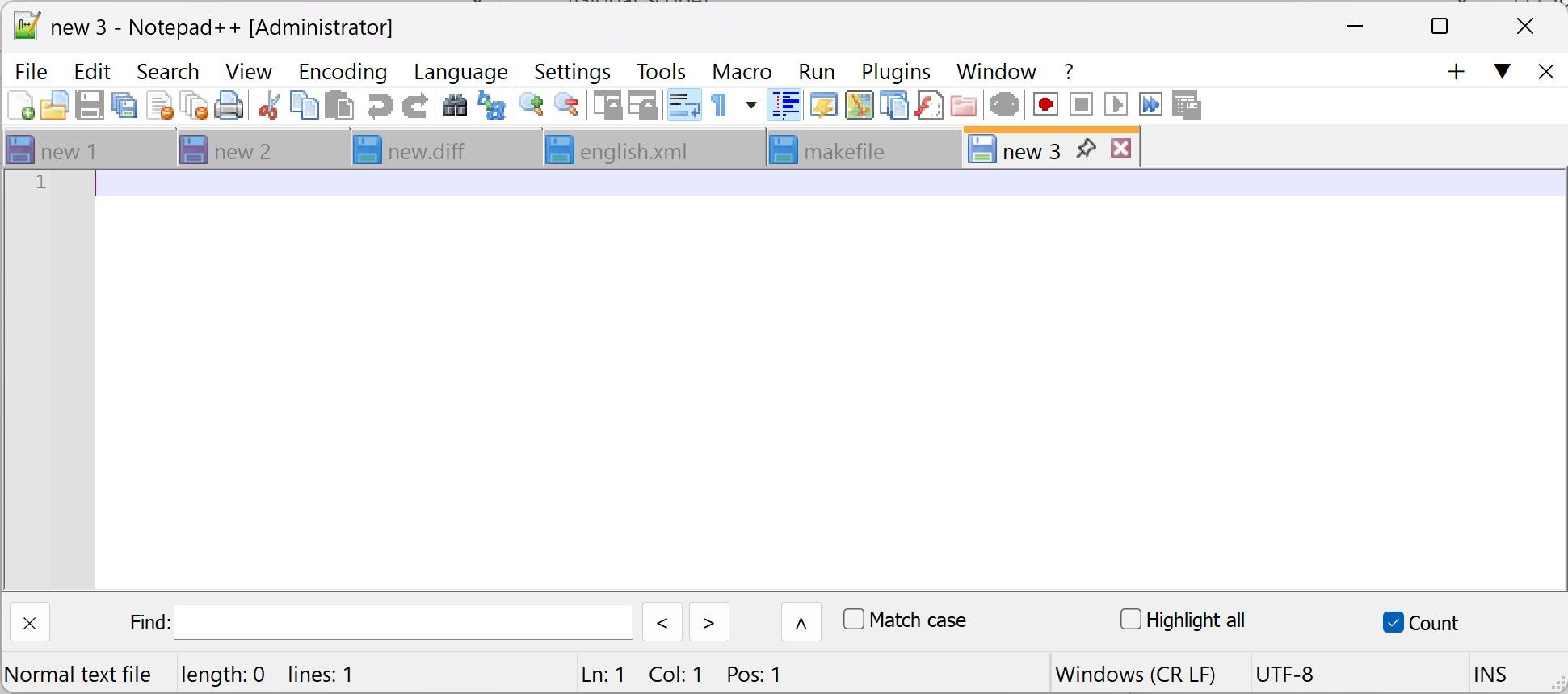
              The best I can do is what @andrecool-68 has suggested:

              A.

              a196a81f-af4a-4b05-a768-b00569c8c48d-image.jpeg

              or we can keep the current one:

              B.

              7b723320-34cf-4ed9-856c-5ceea8d44022-image.jpeg

              ppl are welcome to vote.

              CoisesC 1 Reply Last reply Reply Quote 1
              • CoisesC Offline
                Coises @donho
                last edited by

                @donho

                D. Users will probably strongly prefer one position or the other, not want to change it frequently. Put it in the Preferences instead of on the bar.

                S donhoD peter-fbP 3 Replies Last reply Reply Quote 3
                • S Offline
                  schnurlos @Coises
                  last edited by

                  @Coises I think the idea of donho was to have either the A or B version implemented, not to have the possibility to switch

                  1 Reply Last reply Reply Quote 0
                  • donhoD Online
                    donho @Coises
                    last edited by donho

                    @Coises

                    D. Users will probably strongly prefer one position or the other, not want to change it frequently. Put it in the Preferences instead of on the bar.

                    The advantage of the Up/Down arrow being on the bar itself, rather than as an option hidden in the dialog, is that users can discover/notice this new feture as soon as they use Incremental Search. Moreover, a simple arrow on the bar is easier to understand than a long explanatory sentence buried in another dialog.

                    1 Reply Last reply Reply Quote 3
                    • peter-fbP Offline
                      peter-fb @Coises
                      last edited by

                      @Coises said:

                      Put it in the Preferences instead of on the bar.

                      That would also be my suggestion. A setting that doesn’t get changed often should live in Settings… > Preferences. On the bar, it just clutters it up.

                      1 Reply Last reply Reply Quote 2
                      • andrecool-68A Online
                        andrecool-68
                        last edited by

                        @donho Is it possible to add a button (for the search bar) to clear the text field?

                        1 Reply Last reply Reply Quote 0

                        Hello! It looks like you're interested in this conversation, but you don't have an account yet.

                        Getting fed up of having to scroll through the same posts each visit? When you register for an account, you'll always come back to exactly where you were before, and choose to be notified of new replies (either via email, or push notification). You'll also be able to save bookmarks and upvote posts to show your appreciation to other community members.

                        With your input, this post could be even better 💗

                        Register Login
                        • First post
                          Last post
                        The Community of users of the Notepad++ text editor.
                        Powered by NodeBB | Contributors